Directory layout and design ideas
An overview of the most common directory layouts and their strengths and limitations.
On this page
- Layout types
- 1. Category/collection based directories
- 2. Search / Filter-Centric Layout
- 3. Map-Based Navigation
- 4. Step-Based / Guided
- 5. Single-Page Layout
- 6. Hybrid Layout (Category + Search/Filters + More)
- Conclusion
Directory ideas series
Designing an effective directory isn’t just about listing items - it’s about understanding how people discover, navigate, and interpret information. Whether you’re building a local business directory, a directory of online services, or something entirely different, choosing an appropriate layout is imperative.
There’s no one-size-fits-all solution however, the optimal layout will differ depending on your content, audience, and goals. In this guide, we’ll explore common layouts and their strengths/limitations so that you can pick the right one for your directory.
Layout types
1. Category/collection based directories
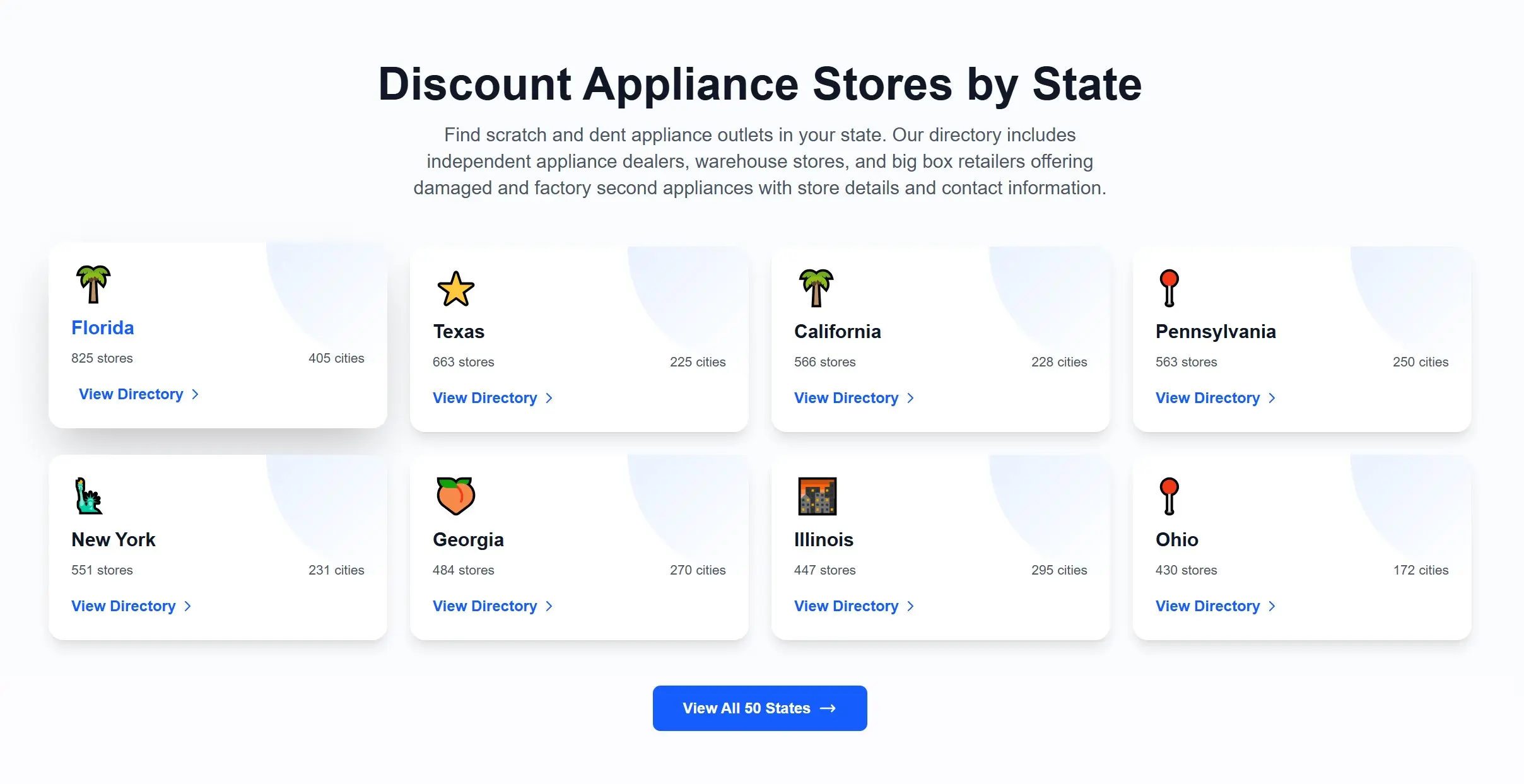
Category-based navigation arranges content in a clear hierarchy. Users drill down through predefined sections until they reach the item they need.
Best for: Structured content that can be grouped logically - ideal for users who prefer to browse or explore.
Strengths
- Familiar and intuitive
- Ideal for education-style or discovery-driven browsing
- Provides structure even when content volume grows
Limitations
- Difficult for wider content sets
- Deep hierarchies can slow down navigation & lead to bad UX
- Not great for exploration across branches
Examples
2. Search / Filter-Centric Layout
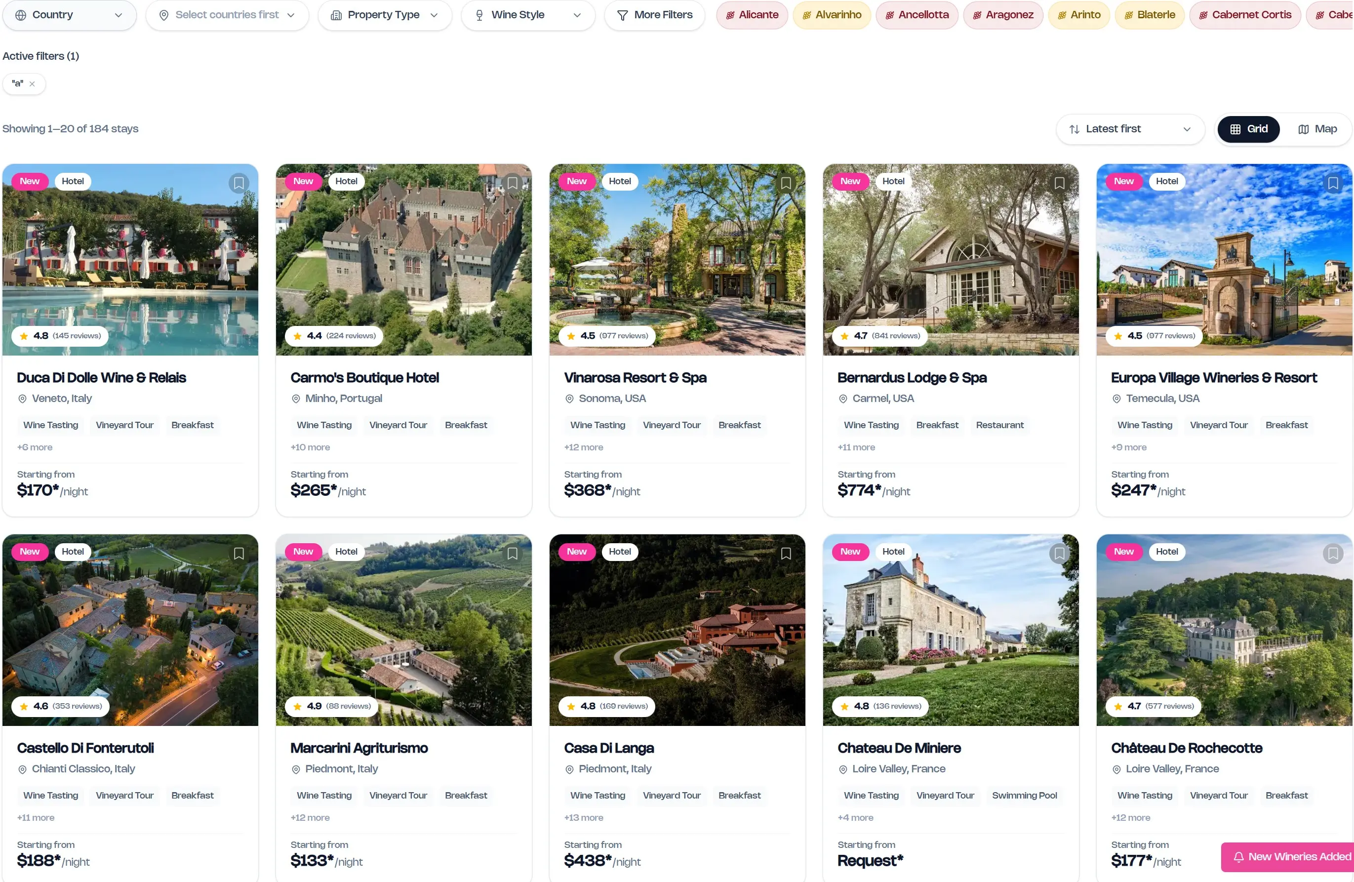
Search/filter-centric layouts prioritise search, filters, and dynamic result lists.
Best for: Large datasets where users know what they’re looking for or need rapid narrowing (e.g. product databases, software listings, job boards).
Strengths
- Very fast access to specific items
- Scales extremely well
- Users can slice data in multiple ways
Limitations
- Requires good metadata
- Cold experience for users who don’t know what to search for
Examples
3. Map-Based Navigation
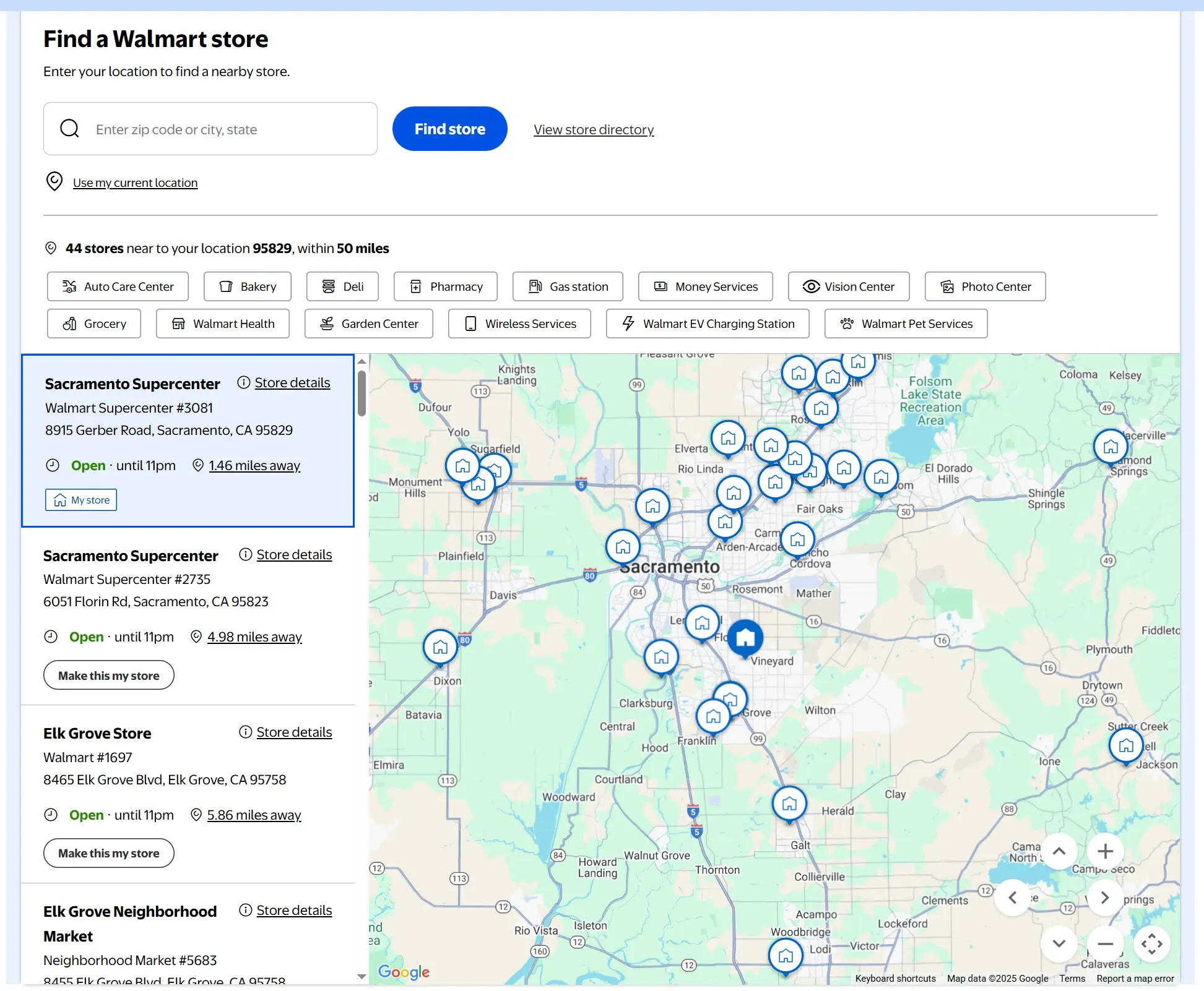
Users browse visually via a map and click markers to reveal item details.
Best for: Anything location-driven - venues, local services/businesses, events, facilities, tourism assets.
Strengths
- Best for spatial understanding
- Perfect for density, proximity, and coverage analysis
- Highly intuitive
Limitations
- Useless if items aren’t location-based
- Requires accurate geocoding
- Can be resource-intensive
Examples
- https://www.walmart.com/store-finder
- https://www.winery-hotels.com/ (click the map button on the right)
4. Step-Based / Guided
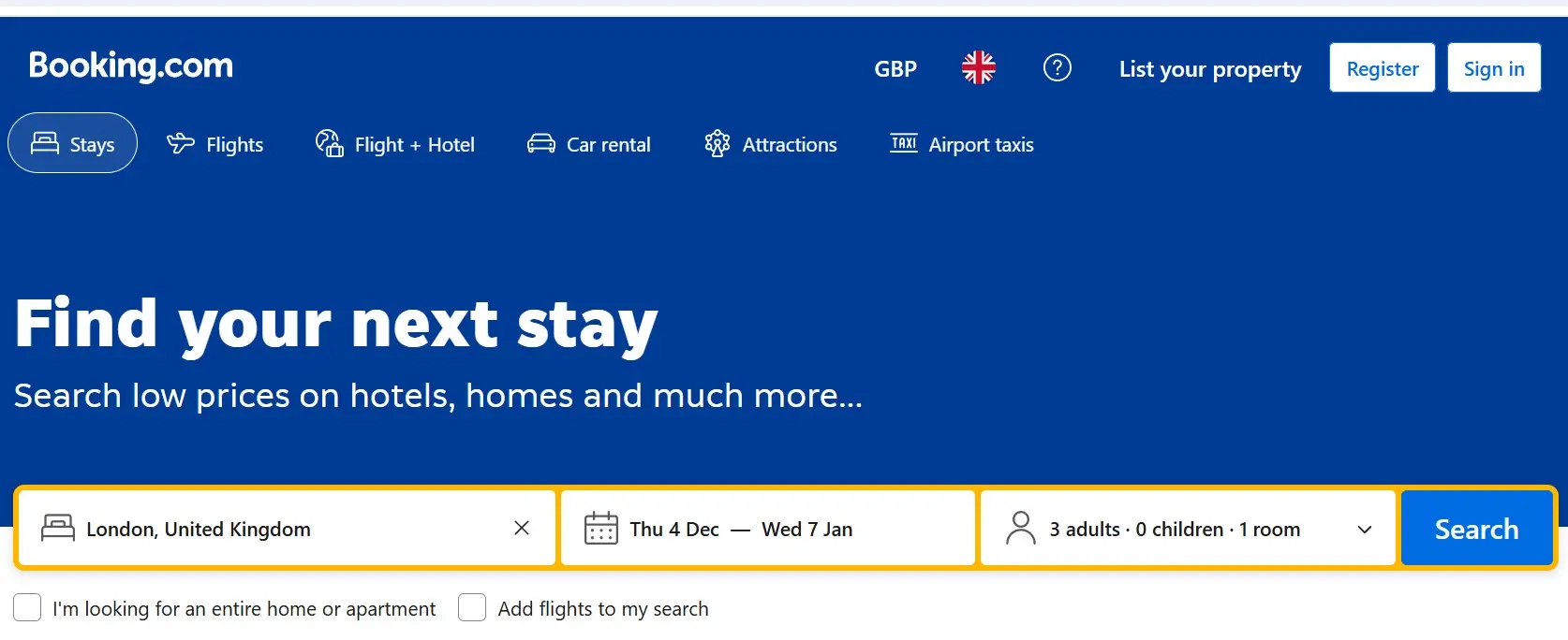
This format asks users a serious of questions before guiding them through to a filtered list of relevant items. For example, booking.com asks users to select a country, date range, and flight type before presenting a list of flights.
Best for: Complex scenarios where only a small number of the possible matches will be relevant to the user. For example a user booking a flight is only interested in one country of departure, in one date range and in flights that have enough seats. Other flights are irrelevant to them. Other examples include accomodation or eligibility checkers.
Strengths
- Removes cognitive load
- Ensures users always reach a relevant subset
- Perfect for regulatory or eligibility-based content
Limitations
- Can be more complex to set up
- Requires a good understanding of what users are looking for and the core filters/fields they're likely to use
Examples
5. Single-Page Layout
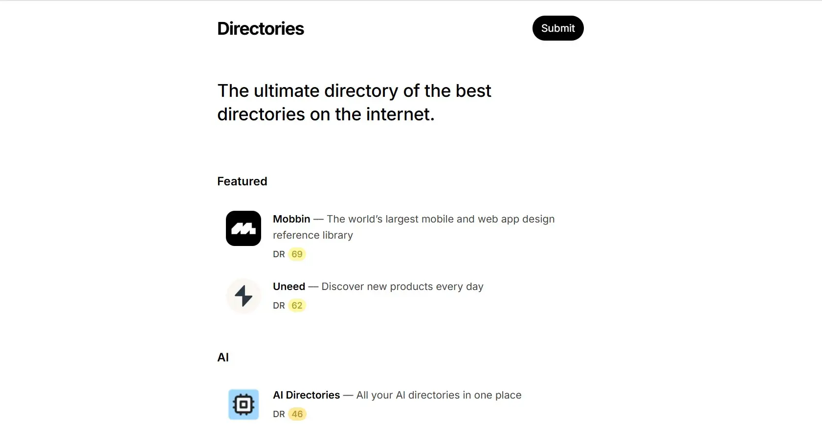
Everything sits on one scrolling page, with content revealed either linearly or through anchors.
Best for: Simple offers, portfolios, micro-directories, marketing pages, or situations where you want full control over the narrative flow.
Strengths
- Clean, streamlined experience
- Ideal for small content sets
Limitations
- Not scalable
- Only one URL, so offers limited SEO opportunity
- Can become bloated quickly
Examples
6. Hybrid Layout (Category + Search/Filters + More)
A range of options are offered to users. This can be presented in a variety of ways. Perhaps the homepage encourages users to drill down into categories, while a separate page presents everything in a searchable/filterable list.
Best for: Large, ambitious directories serving diverse audiences - where users may browse, search, filter, or explore in a variety of ways.
Strengths
- Covers all major behaviour types
- Flexible and scalable
- Reduces friction for different user intentions
Limitations
- Requires careful UX design
- Can become cluttered without hierarchy
Examples
Conclusion
As we’ve explored throughout this guide, there are various directory layouts available - from category-based hierarchies to search-centric interfaces, map-based navigation, guided decision trees, single-page displays, and hybrid approaches. Each has its own merits: category layouts excel at structured browsing, search-centric designs scale well for large datasets, map-based navigation brings location-aware content to life, guided flows remove decision paralysis, and hybrid layouts offer flexibility for diverse user needs.
The key is matching the layout to your specific content, audience behaviour, and business goals. Once you’ve chosen your layout, you’ll also want to think about how individual items are presented - see our guide on directory detail page ideas for inspiration on features like maps, galleries, reviews, and more.
If you need further guidance on choosing or implementing the right directory design for your project, feel free to get in touch.